Latest Flood-Mitigation Funding Trends
New data obtained from Harris County Flood Control District via a FOIA Request breaks down flood-mitigation funding by watershed through the end of 2021. It shows where your flood-bond money is going. It also debunks some popular myths. Those include the oft repeated:
- Rich watersheds get all the funding; poor watersheds get none.
- Partner funding favors rich watersheds because home values are higher.
- HCFCD has historically discriminated against low-to-moderate income (LMI) watersheds.
Eight out of 23 watersheds in Harris County have a majority of residents that fall into the LMI category. That means a majority make less than the average annual income for the region. As the data below shows, those eight LMI watersheds get the vast majority of county, partner, and total funding. In fact, four have received 54% of total flood-mitigation funding since 2000.
Funding now correlates more highly with LMI population than damage!
Data also calls into question why some feel compelled to tweak the equity prioritization framework endlessly.
Improved Basis for Reporting
Before I dive into the data, though, let me point out that between the 3Q21 and the end of last year, the county changed the way it compiles historical data. Instead of using the start/stop dates in project management software and reporting only completed projects, the county is now using invoice dates. This produces much higher accuracy. Dollars do not spill over from one period into another. The new data also reflects spending on projects that are ongoing, but still open.
In response to my FOIA Request, the county provided spending using both the old and new methods. They differ by roughly $615 million. Of that, approximately $215 million reflects actual fourth-quarter spending and $400 million reflects the change in when expenses are recognized.
Spending by Watershed
The rank order of spending by watershed has not changed much since last year. Several watersheds moved up or down by a place or two.
The top four are still the top four in the same order. But some of the amounts changed radically, mostly due to the change accounting. For instance, White Oak increased from $387 million to $521 million. But out of the $134 million difference, $102 million comes from when expenses are recognized.
Because this gets so confusing, and because the rank order did not change much, I will use only the new totals compiled by invoice date from now on. I will not compare old and new totals based on the different accounting methods.

Graphs of Spending
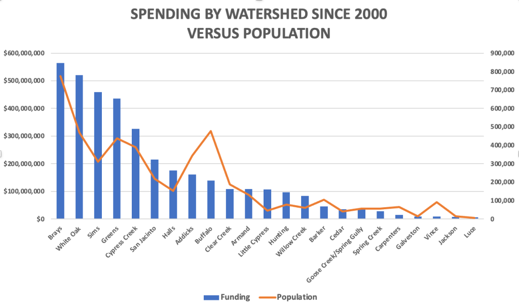
Here’s a graph of total funding by watershed since 2000, arranged from highest to lowest.

Funding correlates with population. But you can see notable exceptions below. Some watersheds get far more funding than their proportion of the population, i.e., White Oak, Sims and Greens. Others get far less.

But population alone does not tell the whole story. Some watersheds are huge and some small. So I also looked at population density per square mile. The curves correlated even less.

As we saw last year, funding flows primarily to damage. The chart below plots funding versus the total number of structures in each watershed damaged in five major storms (Allison, Tax Day, Memorial Day, Harvey, and Imelda). The slope of the curves closely match. But several major exceptions exist.

Historical Discrimination?
Many community groups from LMI neighborhoods have alleged historical discrimination in the distribution of flood-mitigation funding. I just don’t see it. All of the pie charts below take into account all funding between 1/1/2000 and 12/31/2021 based on invoice dates.


LMI Population Now Correlates Higher with Funding than Damage
A coefficient of correlation of 1.0 is considered perfect. A good example: between gallons of gas in your car and the distance they will take you.
As a result of the constant tweaking of the equity funding formula, “Population” and “LMI Population” now correlate more highly with “Funding” than “Damage.” The correlation between “Funding since 2000” and:
- Population Density = .54
- Damage = .85
- Population = .87
- LMI Population = .89
Statisticians consider all of the last three very high.
With all the rhetoric flying around these days, it’s more important than ever to have facts to base your decisions on. To see all the original data from my FOIA Request, click here.
Posted by Bob Rehak on 2/26/2022
1642 Days since Hurricane Harvey


